When you run ads for your ecommerce site and it’s time to enter the URL—the page your audience will land on—which page should you use? Your homepage? A product page? Or a dedicated page built specifically for the offer you’re promoting?
That last option is an ecommerce landing page. It’s a purpose-built page that continues the exact message from your ad and makes it easy for a shopper to say “yes.” The ad earns the click; the landing page earns the customer.
Creative trends swing between glossy studio shoots and raw UGC. But regardless of which style wins the click this week, your post-click experience decides revenue. In some periods, a homepage or a standard PDP might hold its own. Other times, a tightly-focused landing page dramatically outperforms everything. The constant is this: the more aligned your landing page is to the audience, promise, and offer that drove the click, the higher your chances of converting.
This article turns that principle into a practical, repeatable playbook—grounded in a full-funnel view of growth and inspired by approaches shared by Nik Sharma—so you can route traffic intentionally, design smarter pages, and iterate with confidence.
What Is an Ecommerce Landing Page?
An ecommerce landing page is a single-purpose, post-click page designed for a specific audience coming from a specific source (an ad, an influencer’s link, a pre-launch email, a PR article, etc.). Unlike a generic homepage or product page, a great LP:
- Matches the promise in the ad and continues the story without dissonance.
- Answers every key question the shopper is likely to have—so they never need to bounce to Google or your FAQ.
- Presents a focused offer and CTA, with minimal detours.
Think of it as a concierge for one kind of shopper at one stage of awareness.
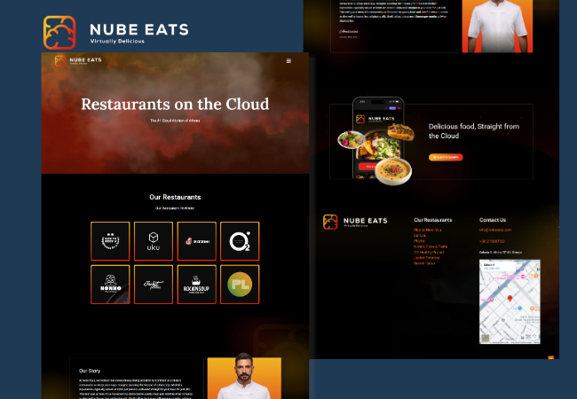
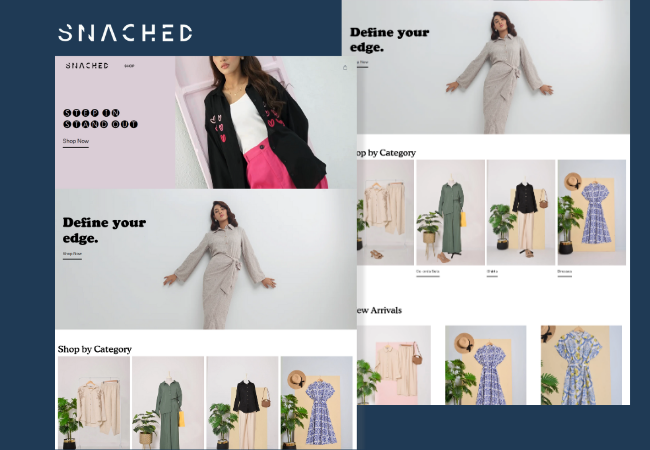
Homepage vs Product Page vs Collection Page vs Landing Page
I recently clicked an ad with a beautiful creative about a specific product. I was interested. But the URL sent me to the homepage. Where was the product I came for? Playing hide-and-seek?
Most brands send traffic to a homepage or broad collection because they don’t want to “miss a chance” to sell other products. They want the opportunity to showcase everything. The intention is understandable—but it introduces friction. Shoppers arrived primed for this promise and this product; now they must navigate, hunt, and guess.
That’s where a dedicated landing page is different. Your LP can feature the exact product/offer from the ad, reinforce the promise above the fold, and—if you wish—merchandise complementary items from other collections without derailing the path to purchase. You can follow CRO best practices (sticky CTAs, objection-killing FAQs, comparison tables, trust elements), spin up multiple variations, and split-test them cleanly across campaigns. Doing all of that on a homepage or a generic collection is rarely feasible without trade-offs in focus, measurement, or speed.
So when should you use each?
- Homepage: Best for returning/brand-aware visitors who want to browse and orient themselves.
- Product Page (PDP): Works for high-intent traffic (e.g., branded search, email “new drop” links) that already wants the item.
- Collection Page: Great for browsing behavior across many SKUs or variants—but typically thin on education and conversion scaffolding.
- Landing Page: Built to educate and convert one segment for one offer. Ideal for cold/colder audiences, new-customer bundles, creator traffic, pre-launches, and campaigns that must tell a story before asking for the sale.
Route traffic based on intent and awareness, not habit.
The Three-Funnel Framework for eCommerce Landing Pages
High-performing ecommerce landing pages map traffic to three awareness stages so the post-click experience matches intent. Doing this lifts conversion rate, AOV, and ROAS while lowering CAC. In practice, you’ll route cold “prospecting” clicks to education, mid-funnel visitors to category proof, and warm/retargeting traffic to a decision page that closes. Here’s the fast, practical way to implement Funnel 0/1/2 on Shopify (or Replo) without bloating your stack.
Funnel 0 — Relatability (earn attention for cold traffic). Your goal here is simple: make the shopper feel “this is for me” so they’ll give you permission to educate them. Lead with a hook that names the problem in the customer’s words, validate it with quick, credible signals (UGC snippets, comment screenshots, a single stat), and introduce the solution category rather than your product. Keep the CTA soft—“See how it works”—and pass UTM parameters forward so you can personalize the next page. Expect modest but meaningful CTR to Funnel 1 and optional email/SMS capture via a lightweight lead magnet. This is classic top-of-funnel SEO and CRO: problem-aware copy, short sections, fast load, and absolute alignment with the ad’s promise.
Funnel 1 — Why the Category? (educate to belief). Now convert interest into belief that this type of solution works. Explain the mechanism in plain language and translate it into outcomes (sleep better, less oil, faster cleanup), then back it with third-party validation (press pull-quotes, expert blurbs, aggregated review themes). Handle predictable objections inline—safety, materials/ingredients, sizing/fit, time to results—and include a light comparison against common alternatives. The primary CTA moves shoppers to the offer (Funnel 2): “See my best option” or “Build my bundle.” Healthy pages show solid time-on-page and double-digit CTR to the decision layer. Treat this as mid-funnel SEO: intent-rich subheads, semantic keywords, and internal links to your hero bundle or BYOB landing page.
Funnel 2 — Why this product/brand? (win the decision). This page closes. Mirror the ad headline, show a clear value stack (price, savings, what’s in the bundle), and make the code auto-apply. Use a sticky CTA, concise benefits in customer language, a comparison table that highlights the 3–5 dimensions shoppers care about, and social proof that’s hard to fake (TikTok Shop reviews, ad-comment screenshots, real UGC). Place FAQs where doubt appears, and state delivery as a date (“Delivers by Tuesday”) alongside guarantees and payment badges. For AOV, lead with a Hero Bundle or Build Your Own Bundle (BYOB); both routinely outperform a generic PDP. Expect higher add-to-cart, 2–8% CVR (category-dependent), and AOV lift versus your standard product page.
Routing & handoff rules that boost ROAS. Send prospecting and broad interest to Funnel 0, listicle traffic and non-branded search to Funnel 1, and retargeting, branded search, email/SMS, and creator links to Funnel 2. Bridge with purpose: F0 ends with curiosity (“See how the fix works”), F1 summarizes benefits and moves directly into the best starter offer, and F2 removes every last friction. Personalize with UTM-aware ribbons (“Welcome, @Creator—10% applied”) and track page-level performance so your attribution reflects each funnel’s contribution, not just last-click.
The Anatomy of a High-Converting eCommerce Landing Page
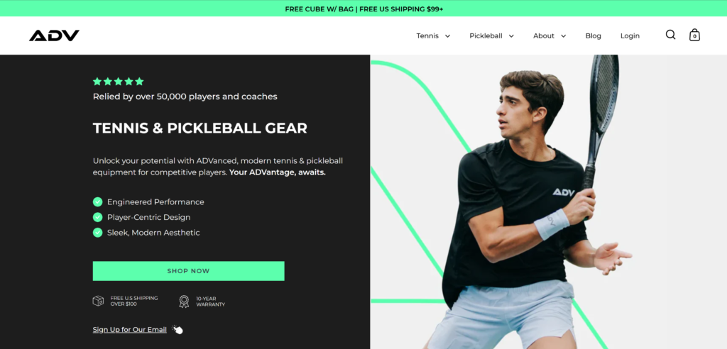
Above the fold: State a clear promise that mirrors the ad. Show the product in context. Surface a credibility cue (e.g., “5,000+ 5-star reviews”) and place your primary CTA where thumbs rest.
Offer design: If it’s a new-customer offer or bundle, make the value obvious and the math simple. Auto-apply codes. Show the discount as shoppers build a bundle.
Benefits > Features: Translate specs into outcomes. “Non-toxic” becomes “cook with less oil and clean up in seconds.” “Infared” becomes “sleep deeper, wake restored.” This is where your review mining pays off.
Layered proof: Mix formats to counter “this could be faked.” Use UGC videos, creator reactions, press pull-quotes—and those high-trust screenshots of comments or texts. Place proof early and often (e.g., after benefits and again near the CTA).
Comparison: Don’t bury the lead. Show how you beat common alternatives on the dimensions shoppers truly care about (lifetime cost, simplicity, durability, taste, setup time).
Objections & FAQs: Price, results timeline, fit/sizing, ingredients/materials, shipping/returns, and “When will it arrive?” If shoppers might leave to find an answer, bring that answer onto the page.
Trust & safety: Guarantees, certifications, policies, and recognizable payment logos all reduce anxiety.
UX that never stalls: Sticky CTAs/cart, fast page load, skimmable subheads, accessible design. Never force a detour to learn something critical.
Personalization: If traffic comes from a specific creator or campaign, acknowledge it. “Welcome, [Creator] fam—your code is applied.” This improves relevance and tracking.
Implementation on Shopify/Replo (without the drama)
Treat each landing page like a modular product you can rearrange in minutes. In Shopify, create three page templates—funnel-0, funnel-1, and funnel-2—and structure each with swappable sections: Hero, Offer, Benefits, Proof, Comparison, FAQs, Trust, Sticky CTA/Cart. If you’re building in Replo, mirror the same module order with components you can reorder per campaign. Keep copy and assets decoupled from layout by storing reviews, UGC embeds, ad-comment screenshots, press quotes, comparison rows, and FAQs in metaobjects/metafields. That way, refreshing proof or spinning a new variant is a content change, not a rebuild.
Make your offers truly turnkey. For code-based promos, use Shopify’s auto-apply URLs—either ?discount=CODE on your LP URL or /discount/CODE?redirect=/pages/your-lp—so traffic from ads and influencers lands with savings pre-applied. Surface perceived value early: show strikethroughs or “You save $X” in the hero/offer block, and repeat it in your sticky summary and the cart drawer. (Preview the discount math on-page; the official discount will apply at checkout.) For bundles, lead with a Hero Bundle section or a BYOB builder. If you don’t use Shopify’s Bundles app, implement a lightweight custom bundle that writes selected items as separate line items (or as line-item properties on a parent “kit” product) so inventory stays accurate and AOV lifts cleanly.
Personalize by UTM to keep the ad-to-page narrative tight and to improve attribution. Read query params in Liquid/JS to toggle creator ribbons (“Welcome, @Jess—10% applied”), preselect variants (?variant=ID), or swap micro-copy in the hero. Save utm_source, utm_campaign, and creator handles into cart attributes or customer attributes so they flow into orders and reporting. This gives you reliable, page-level conversion data and clear ROAS by funnel without relying only on last-click.
On UX, prioritize speed and thumb reach. Keep the primary CTA sticky on mobile; lazy-load below-the-fold UGC and comparison images; compress hero media; and avoid redirect chains on discount URLs. Use your theme’s cart drawer or a Replo cart component hooked into /cart/add.js so adds feel instant. State delivery as a date (“Delivers by Tuesday”) right beside the CTA—this tiny clarity boost often outperforms generic “ships in 2–3 days” copy.
Instrument measurement at the page level. In Shopify, pair Web Pixels/Customer Events with GA4 to log pageview, scroll-depth, add-to-cart, and begin-checkout events per LP handle. For listicles, your north-star KPI is CTR into the decision page; for Funnel-2 pages, watch ATC rate, CVR, AOV, and time to first interaction. Store these in a simple report so you can compare “/pages/funnel-1-educate” vs “/pages/funnel-2-bundle” without sitewide noise. If you’re testing multiple LP variants, split traffic in your ad sets (cleanest) rather than randomizing on-site, and keep one variant noindex to avoid SEO cannibalization during experiments.
Bake in SEO without bloating. Use a single H1 that mirrors the ad promise, descriptive H2s for modules, concise meta title/description, and internal links from related articles to your Funnel-1/Funnel-2 pages. Mark up products with Product JSON-LD where relevant; mark pure LPs as WebPage/Article. Canonicalize variants of the same LP and set temporary test pages to noindex. Fast load, semantic headings, and problem-language in copy (“how to sleep better with infrared,” “non-toxic cookware that cleans in 30 seconds”) give you defensible organic lift while serving paid traffic perfectly.
Finally, iterate weekly. Swap a headline, tighten benefit language in customer words, rotate in fresher proof (especially “hard-to-fake” screenshots), move FAQs closer to the CTA, and test offer framing (value stack before vs after the hero). Because your content lives in metaobjects and your LPs are section-based, these changes take minutes—yet they compound into steady, measurable gains in conversion rate optimization and scalable ROAS.
Hire Propellex for Shopify Landing Page Design and Development.