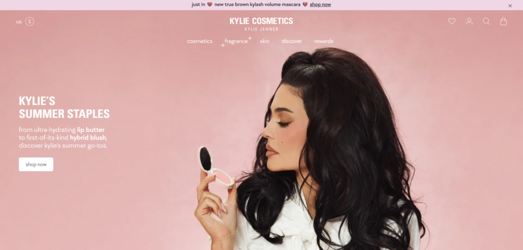
An announcement bar is one of the most effective ways to communicate urgent, valuable, or time-sensitive information to your online shoppers. Whether it’s a sitewide sale, a shipping update, or a product launch, placing a bold message at the top of your Shopify store can significantly increase visibility and engagement.

Most merchants turn to third-party apps to implement announcement bars — but that often comes with trade-offs:
- Monthly subscription costs
- Slower site performance
- Limited customization unless you’re on a premium plan
What if you could build your own fully customizable announcement bar — without installing yet another app?
In this guide, we’ll walk you through how to create a fully functional, flexible, and stylish Shopify announcement bar using only Liquid, CSS, and a little JavaScript. You’ll be able to control everything from the bar’s text, rotation behavior, fade effects, and dismiss button — all natively inside your Shopify theme.
You can follow along this tutorial or hire me for Shopify development. This task took around 5 hours = $50 🙂
Planning the Announcement Bar
Before jumping into the code, it’s important to decide what type of announcement bar you want to build. A little planning upfront will help you avoid unnecessary rework and make your bar more useful and flexible for different promotions or campaigns.
Here are a few key questions to guide your setup:
📝 What kind of content will it show?
- A single static message (e.g. “Free Shipping on Orders Over $50”)
- Multiple rotating messages (e.g. promotions, new arrivals, rewards info)
- Do you want support for HTML formatting like bold, underlined, or linked text?
💡 Tip: If you want to display rotating messages, you’ll need to set up block-based content and add a simple script to handle the rotation.
🎨 How should it look?
- Background and text color — Does it need to match your brand?
- Font size and weight — Will you allow merchants to control font styling?
💡 You can expose these as theme settings so merchants can update styling without editing code.
🛠 Should it be static or interactive?
- Sticky at the top (always visible on scroll)?
- Dismissible with a close (X) button?
- Should the bar reappear on reload or remember the dismissal?
💡 For sticky bars, you’ll want to consider position: fixed and account for layout shift in your header. For dismissible bars, use localStorage or sessionStorage to remember the user’s choice.
🔁 Will it rotate automatically?
If you’re planning a carousel-style announcement bar:
- Should messages fade in/out or slide horizontally?
- How many seconds should each message stay before switching?
- Should users be able to pause on hover?
💡 The easiest animation to implement (and smoothest) is a fade transition using simple opacity and transition in CSS.
Once you’ve answered these questions, you’ll be ready to start building the section inside your Shopify theme. In the next section, we’ll create a new announcement-bar section and set up the basic Liquid structure to render it on your storefront.
Creating the Shopify Section for Shopify Announcement Bar
Now that you’ve mapped out how your announcement bar should look and behave, it’s time to bring it to life inside your Shopify theme.
In Shopify, reusable content blocks like this are best built as sections — self-contained Liquid + JSON + CSS/JS snippets that you can drop into your theme layout (like theme.liquid or header.liquid) and configure through the Shopify customizer.
Let’s start with a basic version of the announcement bar that shows a single message, and we’ll add rotation and animation later.
🪛 Step 1: Create a New Section
- In your Shopify admin, go to Online Store → Themes → Edit Code.
- Under the Sections folder, click Add a new section.
- Name it:
announcement-bar.liquid
Shopify will create a blank file for you.
🧱 Step 2: Add the Base Structure
Paste this into your announcement-bar.liquid file:
{% if section.settings.bar_enable %}
  <div class="announcement-bar" style="background-color: {{ section.settings.background_color }}; color: {{ section.settings.text_color }};">
    <div class="announcement-bar__content">
      {{ section.settings.bar_text }}
    </div>
  </div>
{% endif %}
This code:
- Checks if the bar is enabled
- Displays a simple
divwith background and text color - Outputs the message set in the theme customizer
🎛 Step 3: Add Schema Settings
Below your HTML, define your section’s settings using Shopify’s JSON schema syntax:
{% schema %}
{
  "name": "Announcement Bar",
  "settings": [
    {
      "type": "checkbox",
      "id": "bar_enable",
      "label": "Enable announcement bar",
      "default": true
    },
    {
      "type": "text",
      "id": "bar_text",
      "label": "Announcement text",
      "default": "Free shipping on orders over $50"
    },
    {
      "type": "color",
      "id": "background_color",
      "label": "Background color",
      "default": "#f5f5f5"
    },
    {
      "type": "color",
      "id": "text_color",
      "label": "Text color",
      "default": "#000000"
    }
  ],
  "presets": [
    {
      "name": "Default announcement"
    }
  ]
}
{% endschema %}
With this schema:
- Your bar is configurable through the Shopify customizer
- Merchants can toggle visibility, change text, and update colors without editing code
🧩 Step 4: Add the Section to Your Theme
To make the bar show up on your storefront:
- Open your
theme.liquid(orheader.liquidif your theme separates it). - Insert this code above the header:
{% section 'announcement-bar' %}
Now when you preview your store, you’ll see your custom announcement bar!
✅ Up next: we’ll expand this into a rotating announcement bar with fade transitions, multiple messages, and a dismiss button — no apps needed.
Adding Schema Settings for Rotating Messages
To support rotating or fading messages (instead of just one static line), we need to:
- Let merchants add multiple messages
- Add a toggle to enable rotation
- Set rotation speed (in seconds)
- (Optional) Add dismiss button control
🧱 Update the Schema Settings
Replace your existing "settings" array in the announcement-bar.liquid section with the one below. We’ll also add a "blocks" array to support multiple messages:
{% schema %}
{
  "name": "Announcement Bar",
  "settings": [
    {
      "type": "checkbox",
      "id": "bar_enable",
      "label": "Enable announcement bar",
      "default": true
    },
    {
      "type": "checkbox",
      "id": "rotate_messages",
      "label": "Rotate multiple messages",
      "default": true
    },
    {
      "type": "range",
      "id": "rotation_speed",
      "label": "Rotation speed (seconds)",
      "min": 2,
      "max": 10,
      "step": 1,
      "default": 4
    },
    {
      "type": "color",
      "id": "background_color",
      "label": "Background color",
      "default": "#f5f5f5"
    },
    {
      "type": "color",
      "id": "text_color",
      "label": "Text color",
      "default": "#000000"
    },
    {
      "type": "checkbox",
      "id": "show_dismiss_button",
      "label": "Allow users to close the bar",
      "default": false
    }
  ],
  "blocks": [
    {
      "type": "message",
      "name": "Message",
      "settings": [
        {
          "type": "textarea",
          "id": "message_text",
          "label": "Message content",
          "default": "Free shipping on orders over $50"
        }
      ]
    }
  ],
  "max_blocks": 10,
  "presets": [
    {
      "name": "Rotating Announcement",
      "blocks": [
        {
          "type": "message"
        },
        {
          "type": "message"
        }
      ]
    }
  ]
}
{% endschema %}
🔍 What This Schema Enables
- Merchants can add up to 10 separate messages
- They can choose whether or not to rotate
- They can control how fast the rotation is
- They can decide whether to show a close (X) button
🧩 Next Steps
Now that the theme editor supports dynamic content:
- In the next section, we’ll loop through the blocks in Liquid and output the messages.
- We’ll add fade-in/fade-out transitions using CSS + JavaScript.
- And we’ll hook up the rotation speed and dismiss button logic.
Rendering and Animating Messages in Liquid + JavaScript
With our schema ready, we’ll now update the Liquid template to:
- Loop through all message blocks
- Show only the first message by default
- Set up the HTML structure needed for JavaScript rotation
- Add the optional dismiss (X) button
- Inject a small script to fade between messages
🧱 Step 1: Update the Liquid Markup
Replace the current HTML in your announcement-bar.liquid with this:
{% if section.settings.bar_enable and section.blocks.size > 0 %}
<div
class="announcement-fade-rotator"
style="background-color: {{ section.settings.background_color }}; color: {{ section.settings.text_color }};"
data-rotation="{{ section.settings.rotate_messages }}"
data-speed="{{ section.settings.rotation_speed }}"
>
<div class="announcement-bar__messages">
{% for block in section.blocks %}
<div
class="fade-message{% if forloop.first %} visible{% endif %}"
data-index="{{ forloop.index0 }}"
>
{{ block.settings.message_text }}
</div>
{% endfor %}
</div>
{% if section.settings.show_dismiss_button %}
<button class="announcement-close" aria-label="Close">×</button>
{% endif %}
</div>
{% endif %}
🎨 Step 2: Add the CSS for Fading
Paste this CSS into your theme’s main CSS file (e.g. base.css or component-*.css):
.announcement-fade-rotator {
  position: relative;
  text-align: center;
  padding: 10px;
  font-size: 14px;
  line-height: 1.5;
}

.announcement-bar__messages {
  position: relative;
  height: 1.5em;
  overflow: hidden;
}

.fade-message {
  position: absolute;
  opacity: 0;
  transition: opacity 0.8s ease-in-out;
  width: 100%;
  top: 0;
  left: 0;
  pointer-events: none;
}

.fade-message.visible {
  opacity: 1;
  position: relative;
  pointer-events: auto;
  z-index: 1;
}

.announcement-close {
  position: absolute;
  right: 15px;
  top: 10px;
  background: transparent;
  border: none;
  font-size: 20px;
  cursor: pointer;
  color: inherit;
}
🧠 Step 3: Add JavaScript for Rotation + Dismiss Logic
Paste this just below your HTML in the same section file:
<script>
  document.addEventListener('DOMContentLoaded', function () {
    const rotator = document.querySelector('.announcement-fade-rotator');
    if (!rotator) return;

    const shouldRotate = rotator.dataset.rotation === 'true';
    const speed = parseInt(rotator.dataset.speed || 4) * 1000;
    const messages = rotator.querySelectorAll('.fade-message');
    const closeButton = rotator.querySelector('.announcement-close');
    let current = 0;

    // Dismiss logic
    if (closeButton) {
      if (localStorage.getItem('announcement_closed')) {
        rotator.style.display = 'none';
      }

      closeButton.addEventListener('click', () => {
        rotator.style.display = 'none';
        localStorage.setItem('announcement_closed', true);
      });
    }

    // Rotation logic
    if (shouldRotate && messages.length > 1) {
      setInterval(() => {
        messages[current].classList.remove('visible');
        setTimeout(() => {
          current = (current + 1) % messages.length;
          messages[current].classList.add('visible');
        }, 800); // match transition duration
      }, speed);
    }
  });
</script>
✅ At This Stage You Have:
- A fully working Shopify section
- Theme settings for toggling rotation, speed, styling, and dismiss
- Fade-in/fade-out animation
- LocalStorage-powered dismiss button
Conclusion
Building a custom announcement bar in Shopify without relying on third-party apps gives you full control over both the design and performance of your storefront. With just a few lines of Liquid, CSS, and JavaScript, you can deliver important updates to your customers — whether it’s a rotating carousel of promotions, a shipping notice, or a limited-time offer — all while keeping your site lean and lightning fast.
By integrating your announcement bar directly into your theme:
- You avoid bloated third-party scripts
- You maintain full creative control
- You keep your Shopify admin clean and app-free
And with flexible options like rotation speed, dismiss buttons, and rich content formatting, this custom solution can adapt to any campaign or season.
As always, the best Shopify features are the ones you tailor to your own brand experience — and now, your announcement bar can be one of them.


